Bedrooms are our havens, places to rest, recharge, and express something about who we are. Yet many people shy away from bold paint colors in these intimate spaces, sticking with safe neutrals out of fear they’ll overwhelm. The truth is, vibrant colors, when chosen thoughtfully, can enhance a bedroom’s serenity rather than disturb it. Designers emphasize that a hue that feels meaningful to you is more important than whether it’s considered safe. They recommend balancing vibrancy with calming undertones, ensuring lighting, finishes, and furnishings all work together to support rest and relaxation. In the right shade, daring color can create a cocooning effect, energize a small space, or bring warmth and personality to dim corners. The following are eight designer recommended colors that prove bedrooms don’t have to play it safe, these are hues that uplift, soothe, and turn your personal space into something uniquely you.
1. Symphony Blue
Symphony Blue by Benjamin Moore is a deep, rich blue that tricks the eye in smaller rooms by making walls seem to recede slightly, creating the impression of more space. Despite its saturation, it is calming enough to serve well in a place meant for rest. Designers like this tone because it avoids becoming too energizing, instead, it strikes a balance, bringing both depth and tranquility. Its matte finish can help tone down any glare or harshness, and when paired with softer accents or natural materials, it becomes a soothing backdrop that feels sophisticated and timeless.
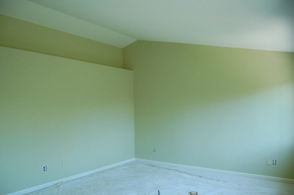
2. Pear Green
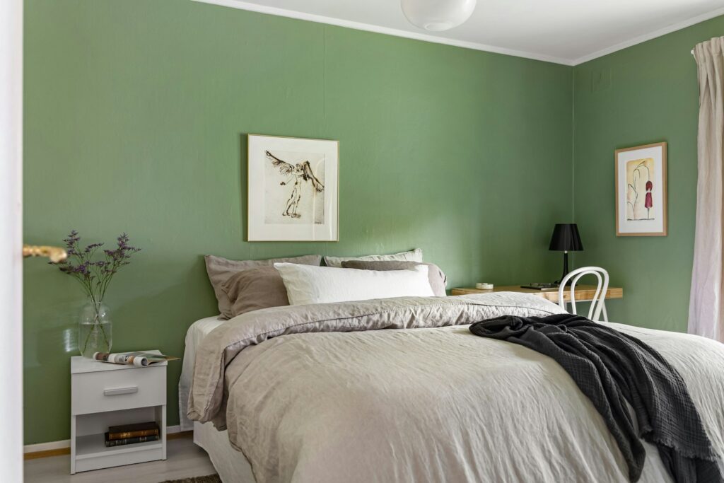
Pear Green is a bold shade that leans lime, chosen for its lively presence and gender neutral appeal, ideal for a shared or nursery space. It injects energy into a room without feeling immature. Designers note it works well where brightness and positivity are desired, especially in smaller spaces that might otherwise feel bland. Since it is vivid, using Pear Green across one or two walls or as an accent color often works best so it does not overpower. The warmth of daylight softens its intensity, while artificial light after sundown can shift its character beautifully.
3. Stone Blue
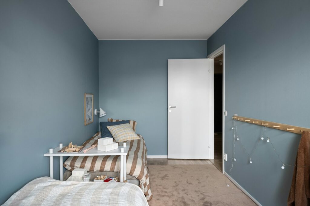
Stone Blue from Farrow and Ball is a color chosen to warm up large, lofty rooms, particularly ones with high or tray ceilings. This shade has warm undertones despite being a blue, making it less nautical and more comforting, grounded. Designers appreciate how Stone Blue can shrink visually cavernous spaces, adding intimacy without making them feel cramped. It works beautifully in natural light, bringing out its gentle warmth, while in cooler light it can seem more muted. Paired with warm neutrals and natural textures, it helps a room feel both elegant and restful.
4. Drizzle
Drizzle from Sherwin Williams is a saturated green with a blue undertone. Its uniquely balanced tones make it tranquil yet dynamic, a rare characteristic that designers highlight. Drizzle is often praised in design for its calming, stabilizing qualities since it sits between warm and cool on the color wheel. Drizzle’s depth makes it a striking choice for something like a ceiling, where it can soften the contrast with walls and bring enveloping comfort. It is especially effective when paired with light trim or textiles to avoid overwhelming the space, creating balance and harmony.
5. Rose Quartz
Rose Quartz by Backdrop is a softer, soothing coral pink tone that feels gentle and restorative. Designers used it on both walls and ceiling in one project to create a sense of retreat, somewhere more than just functional. It leans warm and rosy without being too sweet, which makes it work well for bedrooms where a calm, cozy atmosphere is desired. Light materials and neutral accents help it blend rather than dominate. In low light, Rose Quartz becomes very soft and enveloping, while in bright light, its richer peachy pink warmth comes through beautifully.
6. Blue Danube
Blue Danube from Benjamin Moore is a deep, moody blue strong enough to make a statement, yet with enough depth and saturation to feel restful. Designers recommend it especially in spots like bay window nooks or other architectural features, corners where drama is welcome but you still want peace. It is powerful without being jarring, offering contrast against lighter furnishings or trim. For maximum effect, it is best used as an accent wall or in a room with plenty of light so its richness does not turn oppressive but instead feels elegant and grounding.
7. Bonsai Tint
Bonsai Tint from Sherwin Williams is an energizing green, lush and vivid, a great pick for fun or informal rooms like bunkrooms or spaces meant to inspire playful creativity. Designers love it for rooms where you want to lean into personality and brightness. Because of its intensity, using it in moderation is key accent walls, trims, or selective surfaces tend to work best. It pairs nicely with natural woods, neutral linens, and textures that tame its vibrancy. Lighting influences how bold it feels, with daylight amplifying its zing while softer lighting grounds it into a calmer tone.
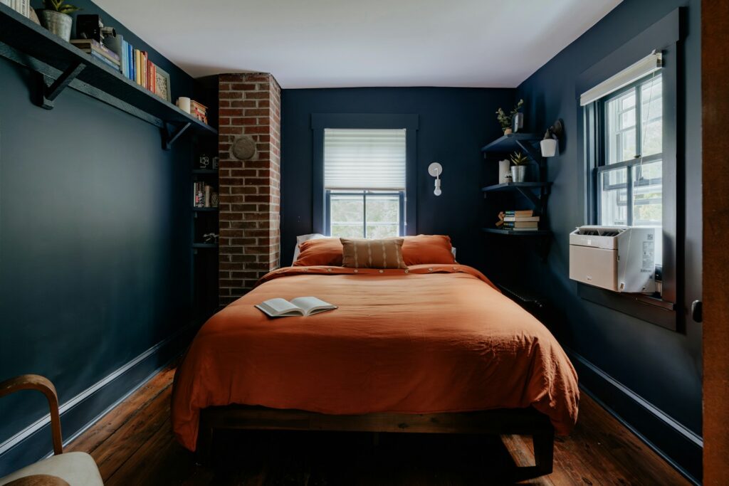
8. Orange Parrot
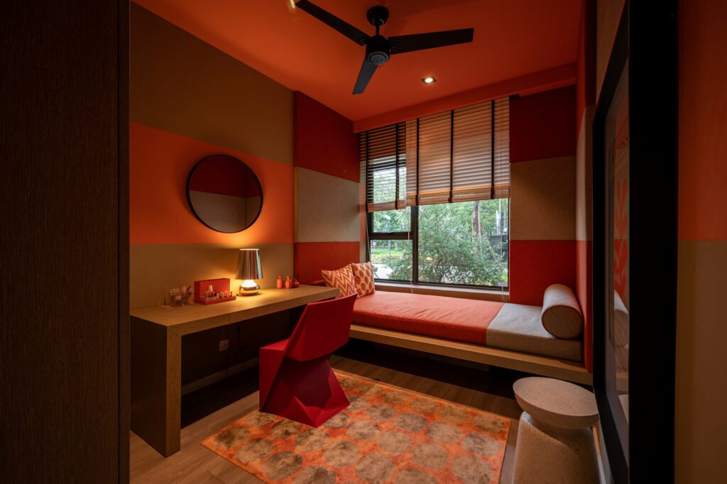
Orange Parrot by Benjamin Moore is a lively, saturating color, especially effective in dim, windowless, or otherwise dark basement bedrooms. Its warmth and striking tone help uplift spaces that might otherwise feel cold or uninviting. It is bold for sure, but when balanced with neutrals, muted tones, or grounding textures like wood, wicker, and soft textiles, it does not overwhelm. Designers suggest careful application perhaps as an accent or in smaller rooms where contrast and light will bounce off its boldness. It brings energy and warmth where they are needed most, making a room feel alive.
Comments