Interior designers often emphasize the role of wall color in how spacious or dim a room feels. Studies in environmental psychology and research by paint companies like Sherwin-Williams and Benjamin Moore confirm that darker, saturated colors absorb more light, while lighter hues reflect it, influencing mood and perception of space. Based on these findings, here are five shades that make rooms appear darker and five that brighten them with a glowing effect.
Deep Elegance: Charcoal Gray
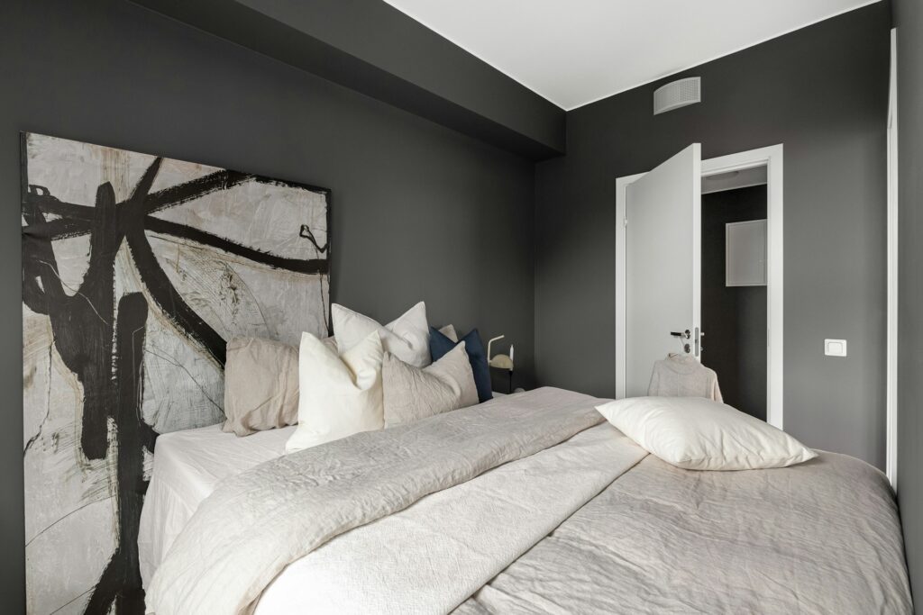
Charcoal gray is known for its moody and dramatic effect, but it significantly reduces light reflection. According to the Light Reflectance Value (LRV) scale used in paint manufacturing, charcoal shades often measure below 20, meaning they absorb most of the light in a room. This makes them ideal for creating cozy, intimate atmospheres but less suitable for small spaces where brightness is desired.
Earthy Boldness: Hunter Green
Hunter green adds richness and depth but also creates a dimmer environment. Paint shades in this range usually fall on the lower LRV scale, around 10–20. Interior experts note that hunter green works best in well-lit rooms with natural light or when paired with contrasting trims. Without adequate lighting, it can make a space feel closed-in and cave-like, especially in smaller rooms or apartments.
Classic Depth: Navy Blue
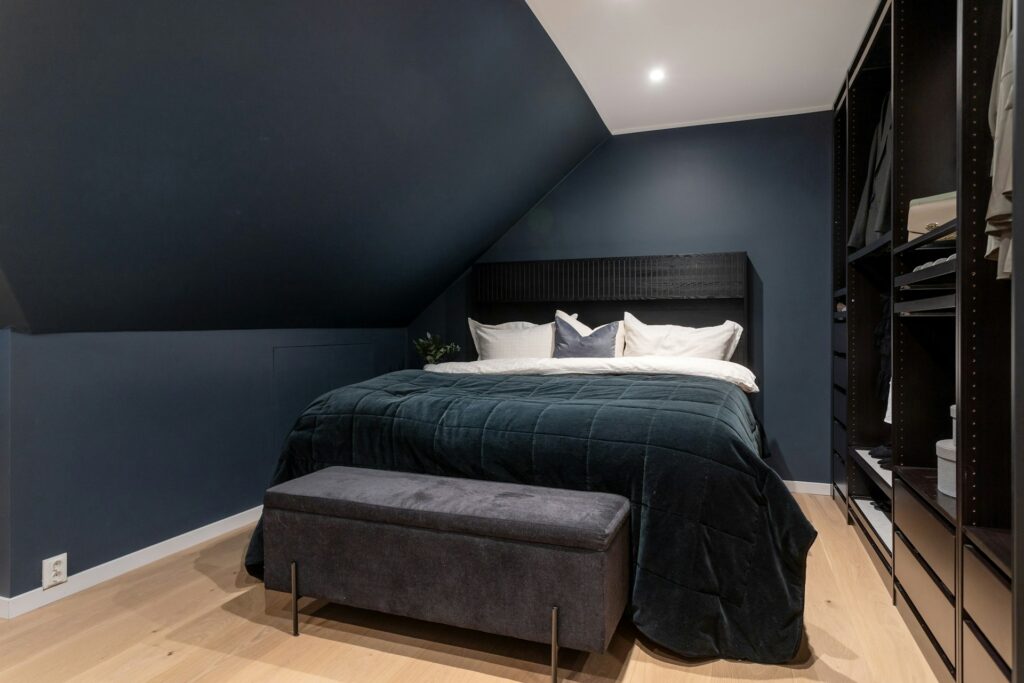
Navy blue is timeless, but its low reflectance value often around 8 to 15 means it absorbs substantial light. Designers use navy to anchor a room, adding sophistication, but it can visually shrink spaces when applied to all four walls. It is more effective as an accent color or when balanced with white or metallic décor to prevent the space from feeling overly dark.
Warm Heaviness: Terracotta
Terracotta, inspired by baked clay tones, has a warm, grounded appeal but tends to darken interiors. Its earthy undertone absorbs light rather than reflecting it, especially in matte finishes. While terracotta can bring coziness and rustic charm, too much of it in poorly lit rooms can create a shadowed, heavy feel. Designers recommend using it with cream or beige accents to offset its weight.
Rich Comfort: Chocolate Brown
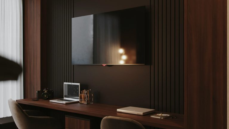
Chocolate brown creates a sense of warmth and comfort, but like other dark hues, it absorbs light and makes rooms appear dimmer. According to design surveys, deep browns often register LRVs under 15, limiting brightness. This makes the color better suited for libraries, dens, or bedrooms where a cocooning atmosphere is preferred rather than open, airy vibes.
5 Colors That Add Glow
Colors with higher Light Reflectance Values (LRV) are proven to bounce more light around a room, making interiors appear brighter and more spacious. According to paint industry data, shades with warm or light undertones enhance natural and artificial light, creating a glowing effect. These colors not only maximize illumination but also influence mood, making spaces feel welcoming and open. Below are five shades that consistently add glow to interiors while maintaining style and comfort.
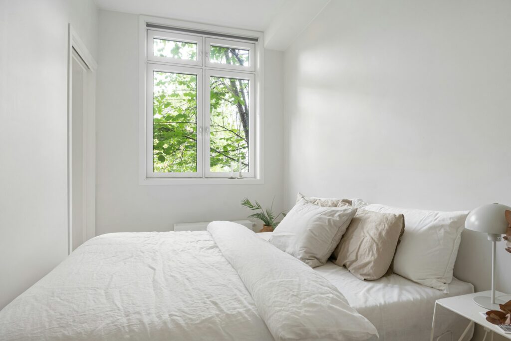
Crisp and Bright: White
White remains the most effective color for maximizing brightness, with LRVs close to 100. It reflects nearly all incoming light, creating the illusion of larger, more open rooms. Paint experts note that white walls pair well with natural daylight and artificial lighting, making spaces feel fresh and airy. However, choosing the right shade of white warm or cool is key to avoiding a sterile look.
Sunny Cheer: Pale Butter Yellow
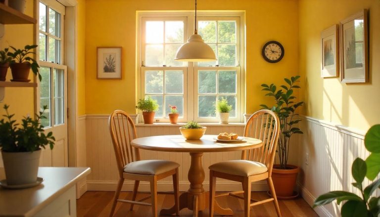
Pale butter yellow reflects light softly, creating a cheerful glow without being overwhelming. Research shows that yellow shades with higher LRVs enhance brightness while maintaining warmth. Designers often use this color in kitchens, dining areas, or playrooms to mimic sunlight and promote energy. Its gentle hue ensures that spaces feel bright yet welcoming rather than stark.
Airy Calm: Sky Blue
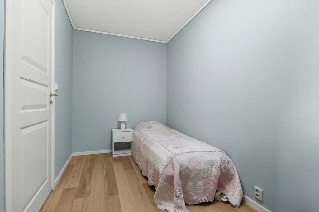
Sky blue, with its high reflectance and association with open skies, adds a sense of freshness and expansion. Lighter blues typically fall within an LRV of 50–70, bouncing light while still offering a calming tone. Studies in color psychology show blue promotes relaxation, making it a popular choice for bedrooms and bathrooms where a glowing yet tranquil environment is desired.
Soft Radiance: Cream
Cream combines the brightness of white with a hint of warmth, offering a more inviting glow. With higher LRV values, cream reflects ample light while reducing harshness. Interior designers recommend cream for living spaces and hallways where natural light may be limited, as it balances illumination with a soft, cozy finish. It also pairs well with both dark and light furnishings.
Gentle Warmth: Peachy Beige
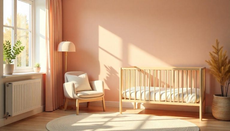
Peachy beige reflects light while adding subtle warmth to a space. Its soft undertones enhance natural light, giving rooms a gentle, glowing ambiance. Designers note that this color works particularly well in bedrooms and living areas, as it prevents a washed-out look that plain white might cause. It offers a balance of warmth and brightness, creating welcoming interiors without appearing too bold.
Comments